
Getting critical data noticed
With remote-working, data needs to exist where its audience lives.
It feels like we’ve crossed a threshold. Businesses (and the general public) are increasingly calling for more data, and for it to be presented in a smart and pedagogic way.
But we are living in a seriously distracted time. Knowing we need to be looking at data is very different from having the trigger to actually do it. Too often, the idea that we need to check on the progress of a chart is so far down the list of shiny new things to look at that it remains a noble effort, like signing up for the gym but never finding the time to go.
How do we wedge business critical data into this distraction disaster zone, especially when the real insight from the data often can’t be explained in a 140 character chunk?
I thought this was a solved problem. A well designed physical dashboard (eg a large wall display) in full view of the team could provide intuitive visuals to let people spot a “what”, and then understand the “why” in the data.
And then came COVID, and suddenly the people who would see these dashboards were no longer sitting in the same room.
We already know that just sending a URL out to people is not enough — it won’t be looked at — at least enough to be worthwhile, so how do we solve this?
When you (eventually) go back to the cinema to watch a two hour epic, you will probably decide to go whilst watching a two minute trailer. And you probably only watched that trailer because you saw a poster or a twenty second advert. The cinema trip wouldn’t happen without the trailer or poster, and you might see twenty different posters a day, but the one that attracts you won’t satisfy your appetite for the film on its own.
This is the flow that we’ve got to get ourselves into, a sort of a system 1 (“intuitive”) thinking pattern to lead into system 2 (cognitive thought) when it’s required.
Let’s call these two ends of the chain “the bite”, and “the body”.
“The body” is a variant on the dashboard we build already, it should be giving multiple indicators and insights to form an opinion or decision. But it differs in two ways to what we would usually build. Firstly it can be found at the end of a URL/link, because “the bite” does the work of attracting interest to it. Secondly, because it doesn’t need to do double-duty of attracting attention and serving up depth, it can be re-configured assuming the viewer already has a view on the data when they start looking into it. In an ideal world, you could have variants of dashboard for different analysis, depending on the link in message of “the bite”.
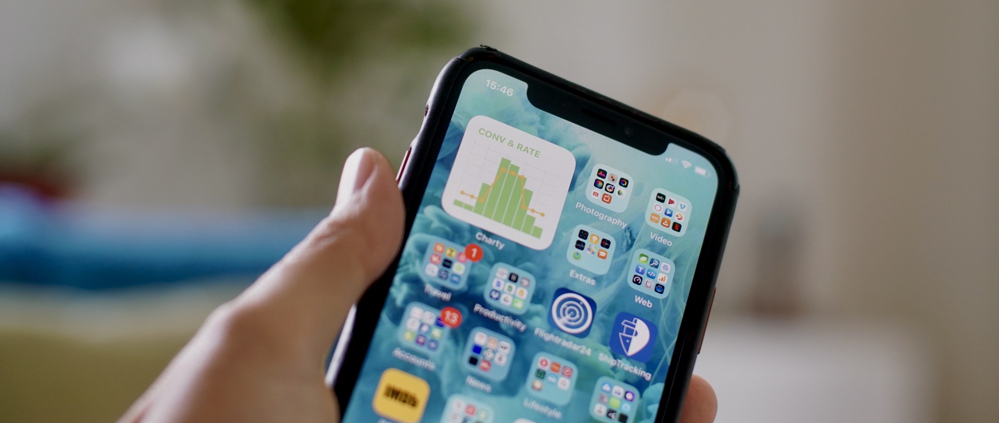
chartyios.app in an iOS14 widget
“The bite” is more interesting, because there are so many options available to us. Let’s talk about the medium before we get into the message.
Push notifications (SMS, email, adhoc Slack messages) have baggage. They have a very important place in alerting people to conditions that need immediate attention, but if you use them as a way to simply update people, they quickly become ignored. Preference and psychology play a part here — I tried automating daily SMS updates and it fell flat, but sending a daily screenshot of a simple dashboard into a Slack channel provided a team with some really good context for their daily conversations.
However, my current favourite option is with smartphone home screen widgets. Living in an iOS centric country, I missed out on creating these in Android, but now I’m fully onboard with the upcoming iOS14 update, testing it with some third-party software that will launch alongside the OS (Scriptable, Charty, WidgetPack) to present simple data on a user’s home screen amongst their regular icons.
the audience already chooses to look at this screen an average of 58 times a day...
This approach has multiple advantages. The first is this the audience already chooses to look at this screen an average of 58 times a day. Who needs a daily push update, when the viewer is already looking at these pixels several times an hour. And that means viewers start to see realtime patterns (for instance daily routines in global markets), leading to deeper insights and helping to spot breaks in the expected results.
Our problem will eventually be more competition with distraction — when your viewers have shiny home screen widgets for other data (screen time, health data, etc), will your data widget be pushed onto the third screen that never gets viewed?
If that’s the medium, what about the message? First we need to get attention, and this is where the format of a widget is more useful than a notification, because the background colour can show at a glance it’s worth noticing or ignoring. This is more crucial than any KPI displayed, because viewers need to be given permission to ignore data, so that when it’s important they are more disposed to notice it.
In the foreground, we’ve found that a single KPI with some sort of comparison context is most useful. For example, “sales today so far” vs “sales at this time yesterday”. That seems to give users enough context to decide if the widget background colour represents a significant change, worthy of investigation. Going further by clicking from the widget to a dashboard is often not necessary, positive outcomes are often taken at face value, whereas unusually negative results tend to make viewers want to know “why”.
In tests, widgets also turned out to be the best goal tracker we had, viewers can check them quickly, as much as they want, wherever they are, to see if their preferred KPI has hit target (useful in competitive sales environments). This also means the more complex dashboards (“the body”) are under much less load.
Very soon you will see lots of screenshots of these widgets in social media as a shorthand to a humblebrag.

JS script running in a scriptable.app iOS14 widget
Just like the cinema example earlier, you could have more constituent parts than just two — you might have “the bite” leading to an in-app overview that helps you decide if it’s just an anomaly, or needs further investigation in a third dashboard. Just so long as the user gets the right messages promptly that leads to the right outcome.
What we’re trying to do is to bring data to the screens the audience is already looking at — instead of forcing the audience to journey to the data. By doing this, we could start to not only deliver on the idea of “more data”, but to deliver a non-intrusive way of actually getting it noticed.
The results of data getting regular attention will lead to it being much, much more useful.